

Are you disillusioned with the conversion performance of your mobile traffic? Mobile conversion optimisation can potentially fix that issue. I'll take a deep dive into how it works and provide some useful tips.
If you want to turn your mobile visitors into paying customers, you must focus on mobile conversion optimisation.
Mobile devices have been one of the catalysts for the rapid rise of eCommerce in recent years.
According to Statista, in 2021, mobile users accounted for 72.9% of eCommerce sales—translating to over 3.56 trillion dollars of revenue worldwide.
Unless you want your eCommerce store to be left out, you should include mobile conversion rate optimisation in your marketing strategy.
What is mobile conversion optimisation?
If you have a website, you likely already have an idea of what mobile conversion rate optimisation is.
Mobile conversion rate optimisation, or mobile CRO, aims to increase the likelihood of turning mobile visitors into leads or customers.
It focuses on helping you convert the success of your mobile marketing efforts into results that benefit your bottom line.
Let's say you have an online store that's accessible from a mobile device. Your main objective with mobile conversion rate optimisation is to increase sales, upsells, and repeat customers through your mobile site.
Of course, not all mobile conversion goals are tied to sales.
A mobile conversion might also happen when a user subscribes to your newsletter, downloads your eBook, fills out a contact form or registers for your webinar.
Whatever your business goals are, mobile conversion optimisation will help you achieve them.
Mobile conversion optimisation best practices for 2025
Now that I'm done with the introductions, it's time for some actionable tips.
Below are five proven conversion rate optimisation strategies that will allow you to drive sales through mobile:
1. Have a mobile-first approach when designing forms and pages
It's time to face the facts: Mobile users now make up the majority of all internet traffic.
Many businesses and online services, including Google, have already adopted a mobile-first mindset (read my commentary on Google's 2016 announcement here). This time, it's your turn to do it—starting with mobile landing page optimisation.
When using a landing page or form builder, use your editor's mobile view feature.
For example, when using Elementor for WordPress, you can easily switch to your mobile site view by clicking 'Responsive Mode.'
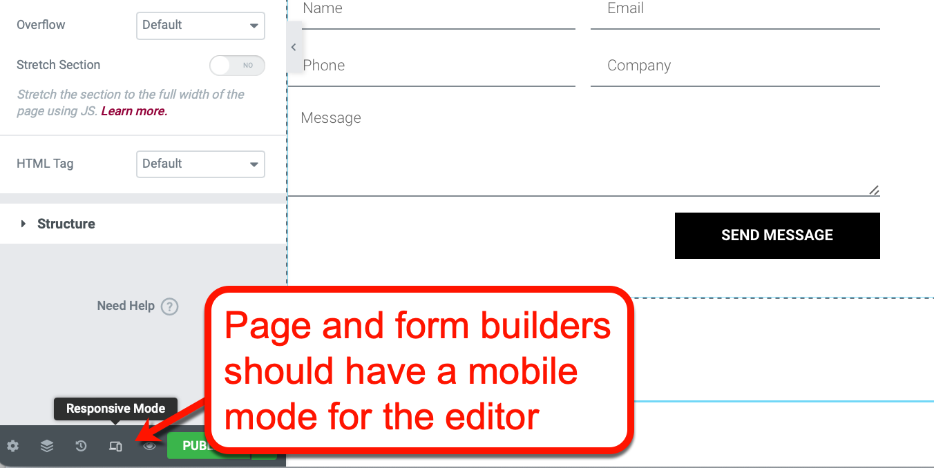
Image source: Elementor.com
Upon switching to this view, the editor should now show what your page looks like on mobile screens.
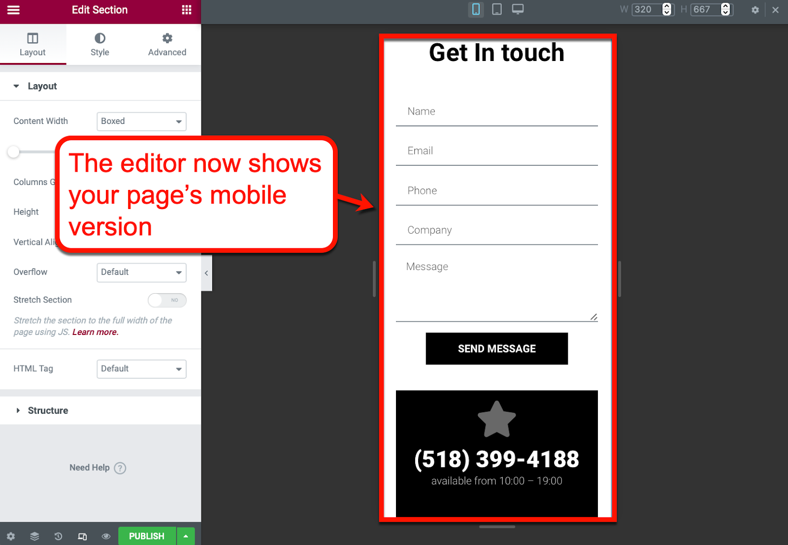
Image source: Elementor.com
Designing pages and forms with mobile phones in mind allows you to better optimise the experience of mobile users. As opposed to customising the mobile version of your desktop site, a mobile-first strategy leads to higher mobile conversion rates.
Going mobile-first also means prioritising the experience of mobile users, stretching all the way back to keyword research. Tools like SEMrush now allow you to focus on finding mobile keywords to make sure users don't have inaccurate expectations from your content.
2. Make sure conversion elements are accessible
You'll have difficulty converting mobile shoppers if your "buy" buttons are copied from your desktop site.
Even with a mobile-responsive design, there's a chance that conversion elements—from buttons to links—are packed too close together, making them harder to click or tap on a mobile device.
As a rule of thumb, create conversion elements that are large enough to be comfortably tapped with users' thumbs. A good strategy is to let them occupy an entire row of your mobile site.
For example, check out how eBay displays product pages:
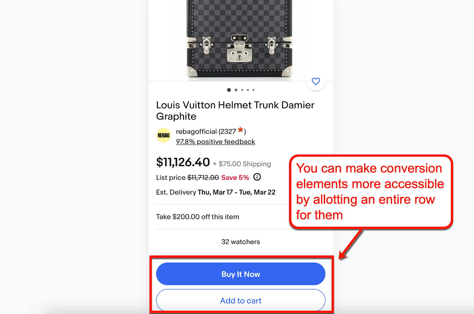
Image source: eBay.com
Having entire rows allotted for conversion elements is also helpful if your mobile site pages have multiple options. This will make it easier to tap the correct elements.
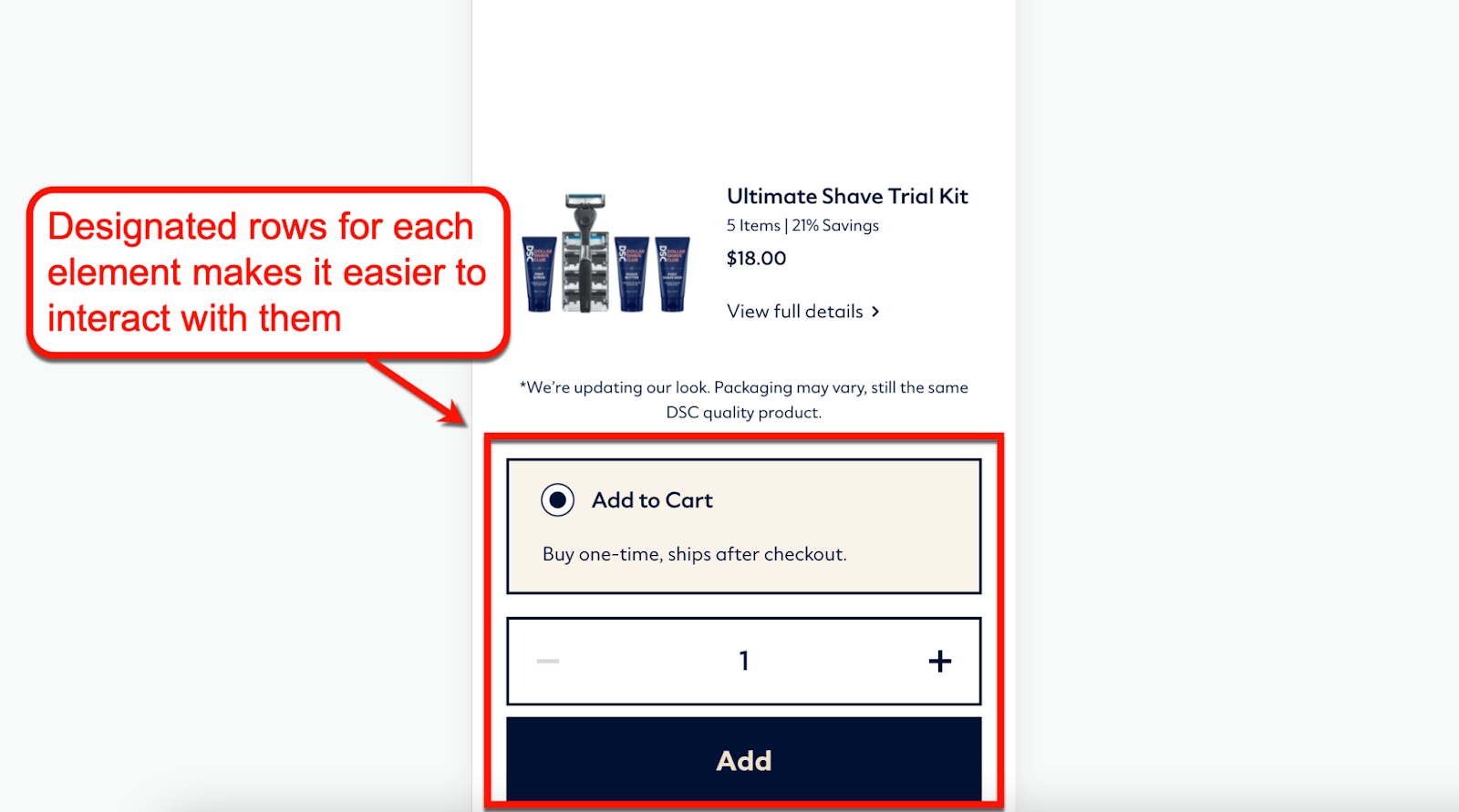
Image source: DollarShaveClub.com
Want a better way to create visual conversion elements?
You can create optimised images for mobile using a graphic design tool like Canva. Its drag-and-drop interface allows you to create fantastic product images with overlays, text, and filters.
It also comes with the "Background Remover" effect, making it easier to create professional-quality product photos.
3. Enable social logins
Most users already have their social media accounts logged in on their mobile devices.
To create a seamless experience, consider allowing them to sign up or make purchases using these accounts. Doing so will drastically simplify the process of purchasing and encourage more mobile conversions.
Enabling social logins is one of the growing mobile marketing trends that brands like Adobe follow.
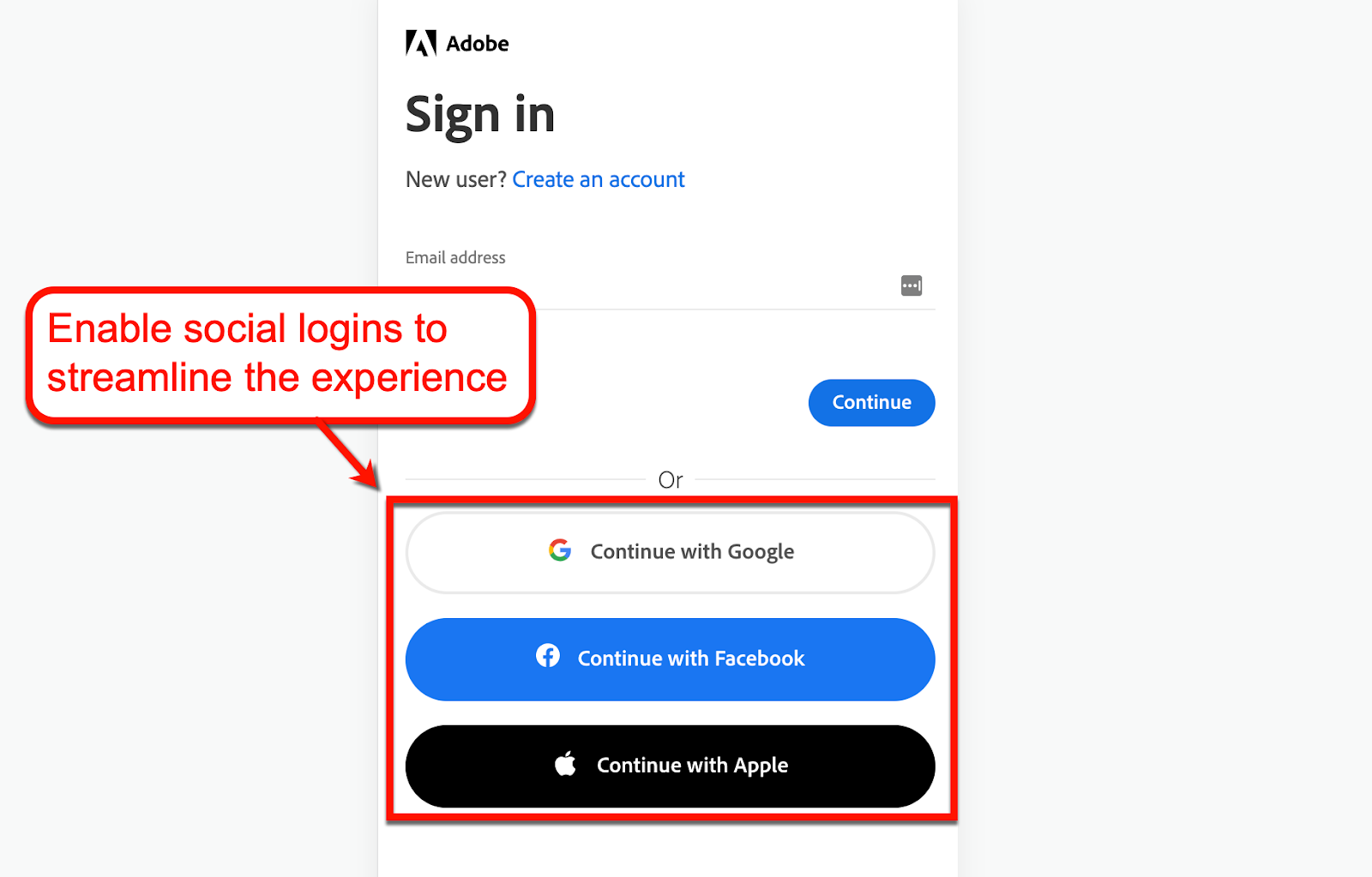
Image source: Adobe.com
Tip: If your website runs on WordPress, you can easily implement this feature using a social login plugin.
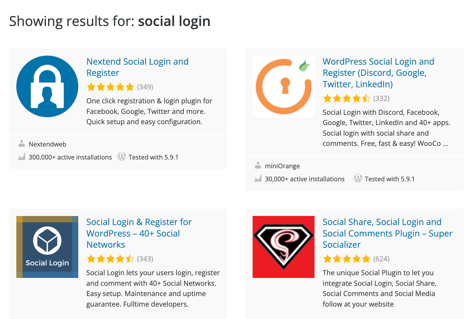
Image source: WordPress.org
4. Create multi-step conversion experiences
For desktop users, filling an entire form with multiple fields on a single web page is easy. But for mobile visitors, it can be a nightmare.
For example, Apple is supposed to be a brand at the forefront of design when it comes to accessibility. However, filling up forms on their mobile site can be intimidating.
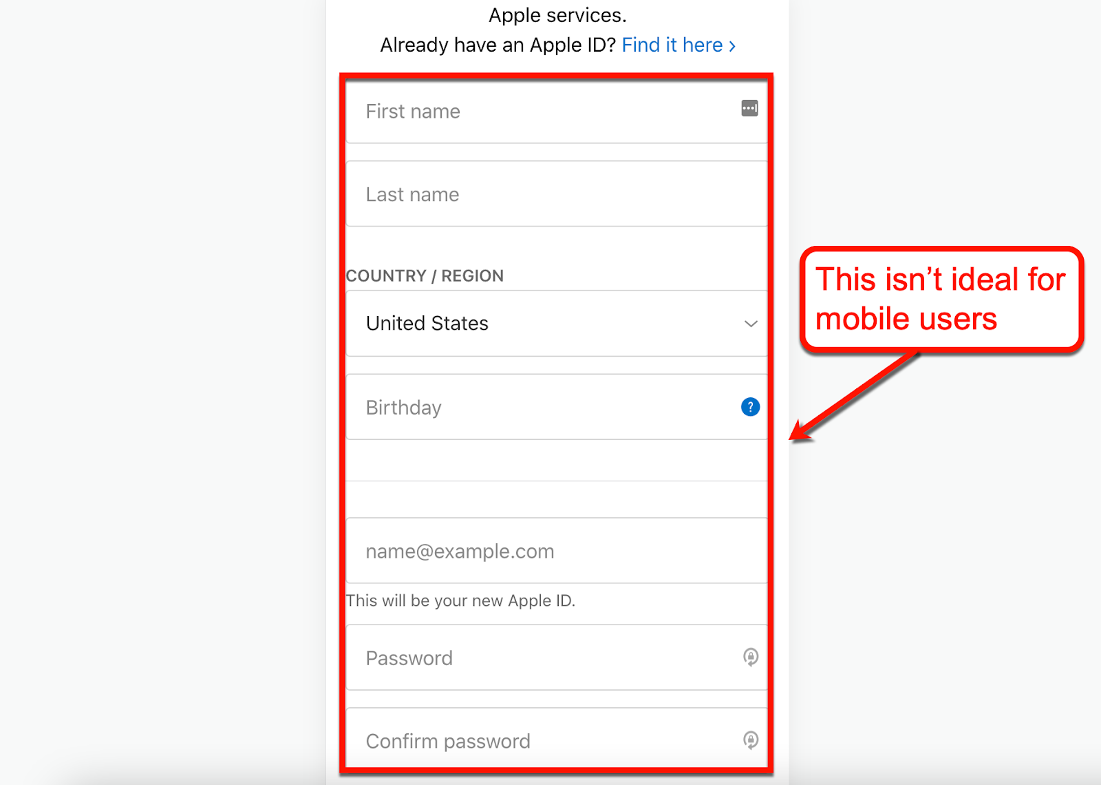
Image source: Apple.com
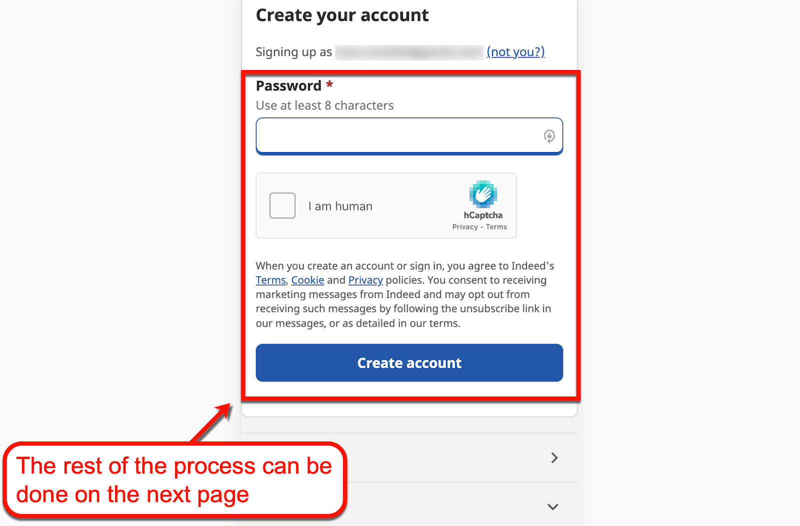
Consider using a multi-step strategy to make the conversion experience more inviting to users.
You can take a page from Indeed's book and start with a single step to kick off the conversion experience.
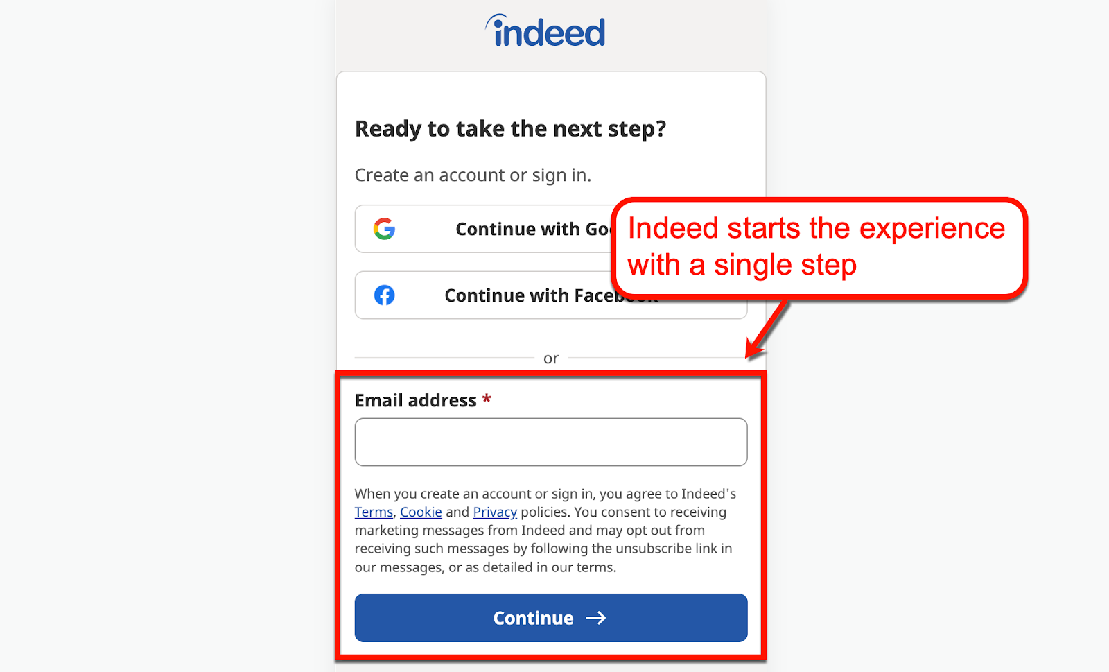
Image source: Indeed.com
The registration process can then be completed on the next page. And while Indeed requires users to solve a CAPTCHA, the test is highly simplistic and doable even on mobile devices.
5. Optimise your site's mobile performance
Page loading speed is imperative to conversion rate optimisation, especially for mobile sites.
Remember, you lose roughly 53% of your traffic if your mobile site takes over 3 seconds to load. That's over half of your potential customers leaving simply because your mobile website isn't fast enough.
As such, mobile optimisation should include page speed optimisation. And more often than not, this requires the right tools and services to be done effectively.
Three top CRO tools
Speaking of tools, here are three helpful CRO tools that can help you secure more conversions on the mobile version of your site:
1. Google Optimize
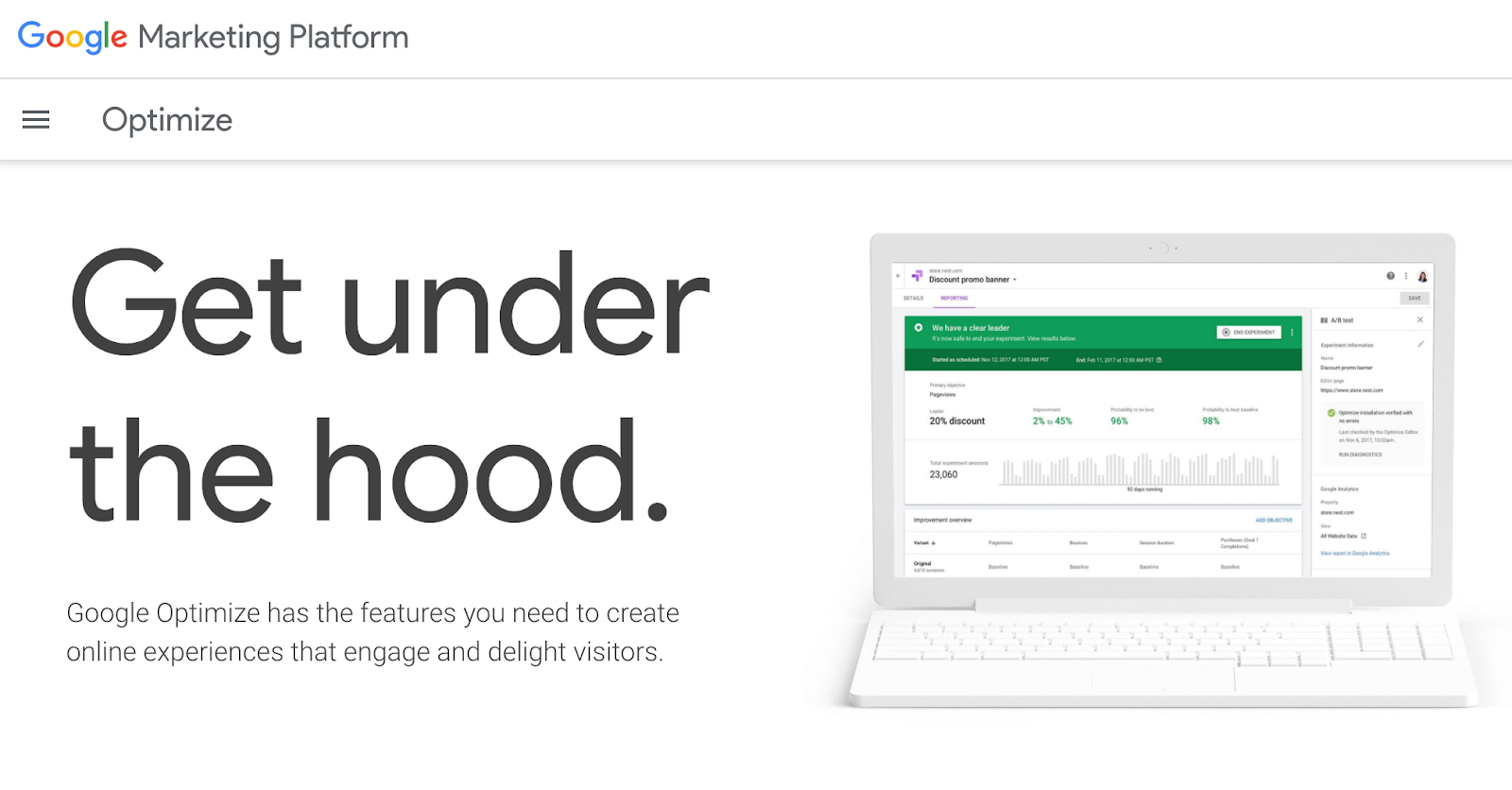
Image source: Optimize.Google.com
Google Optimize is an experience optimisation tool that focuses on A/B or split testing.
You can use it to create multiple versions of mobile web pages and compare their performance side by side.
2. Google Analytics
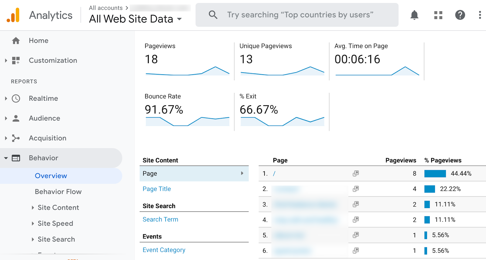
Image source: Analytics.Google.com
Google Analytics is a must-have tool if you want to scale your mobile content strategy and track conversions.
It will give you a complete view of the performance of your mobile website. You can identify your top pages, track engagement metrics, as well as monitor conversion goals—from page visits to sales.
3. PageSpeed Insights
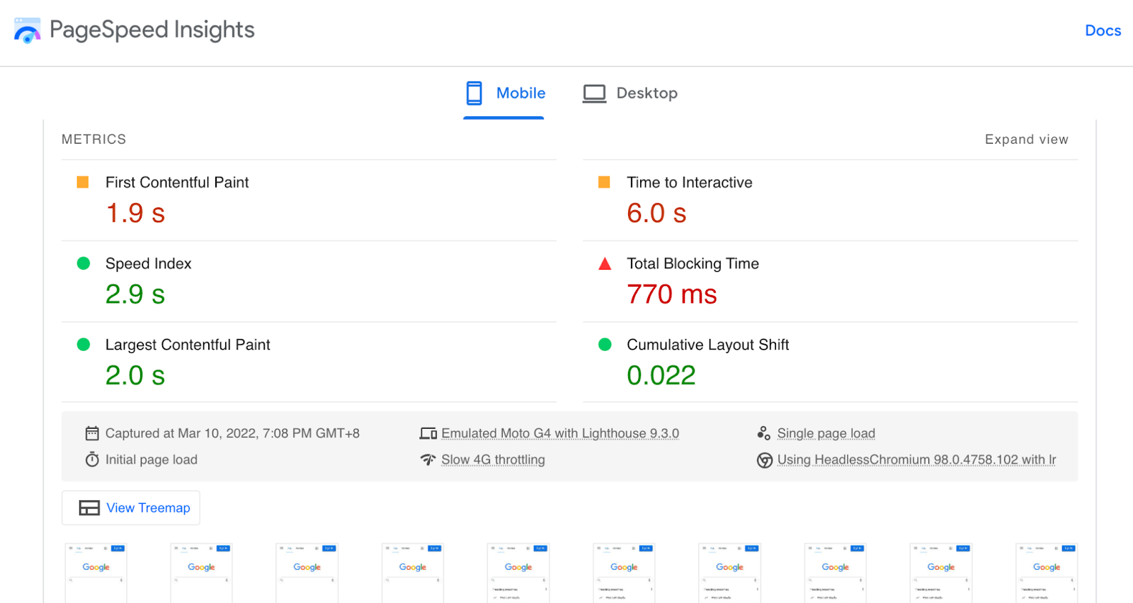
Image source: PageSpeed.web.dev
To help optimise the loading speed of your mobile site PageSpeed Insights will identify performance-related issues for you.
More importantly, the tool will provide you with a list of optimisation suggestions along with a wealth of resources.
Give mobile conversion optimisation serious thought
Mobile CRO is something every brand should put effort into, especially in the modern digital world.
With so much at stake, handling it by yourself can be daunting so I'm always here to help you improve the conversion rate on your mobile website, should you need help.
Take the first step today by booking a free consultation here.