
So, you're glad your marketing investment is paying off and your site is attracting reasonable traffic. What next?
If you're like most businesses, you've probably put the cart before the horse by spending on PPC and SEO before fully optimising your site for conversions. Chances are that your conversion rate is much below what you could potentially achieve. It's because you've made some common mistakes on your sale or subscription pages, mistakes that kill conversions.
Take a quick read through these conversion killing mistakes...
#1. Your Site is Visually Pretty, but Useless
People come to your website with the intentions of accomplishing certain tasks. They may be looking for information, comparing prices, buying a product, etc. The single goal of your website or landing page is to enable users to quickly and smoothly achieve their objectives. If your sites doesn’t do this, it's useless for your visitors regardless of how pretty it may look.
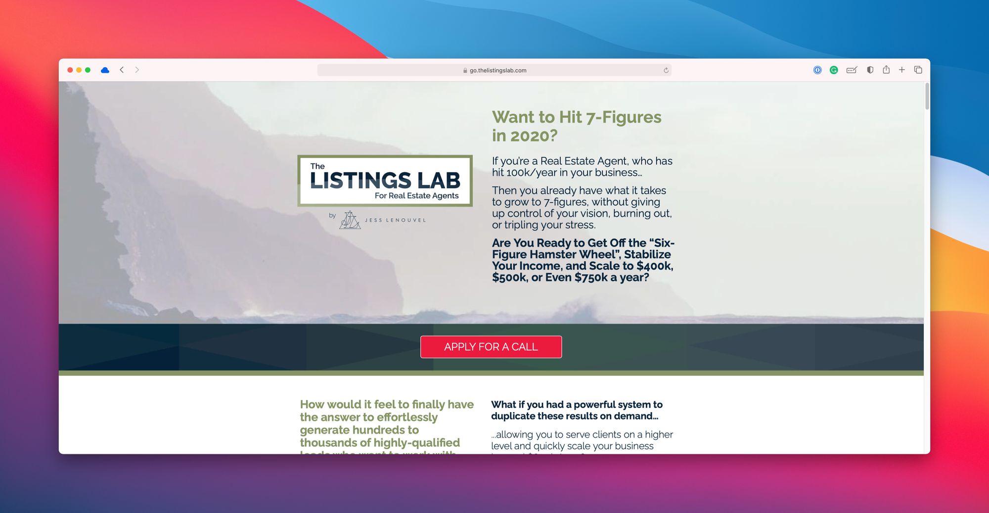
In order to keep your visitors from hitting that dreadful back arrow, it is crucial to design your site with them in mind. Build your understanding of your customers and their needs before building your website. Aligning the user experience with the user intent is the overarching rule for creating high-converting pages. High converting sites are not always pretty. Think Craigslist, or look at the ugly affiliate home page below that converts very well.
Designing for Your Customers:
Keyword research is a good starting point, but designing a high converting user experience will take more than just keywords. You'll need to get out of the office and talk to your customers.
Organise focus groups, create roles and personas, track their online behaviour and, and discuss with your associates. Your aim is to know the customer intent behind the main keywords driving you traffic, and satisfy that intent by providing relevant, quality content on your landing page.
#2. A Confusing Main Headline
Your main headline is the first thing your visitors read on your page. Unless it directly addresses their concerns in simple words, they'll get confused and click away. Don’t write a clever or complicated headline. Instead, write a simple and compelling answer to the biggest question on your visitors' minds.
- Try to pique your reader's emotion by using sensory words, such as taste, feel, imagine, see, etc
- Make people curious, excited, optimistic, fearful, or pleased by using power words
- Create a sense of urgency by using words like now, today, by midnight, etc
- Include a part of your CTA in your main headline to make your page more consistent.
#3. Poor Quality Images
The first impression is the last impression, and the photos on your page are the first to tell your visitors what kind of a business you are. Low quality images will deliver a bad impression of your business, which is bad for conversions.
Product images are important because in the absence of a touch-and-feel experience, they are the only cue your visitors have for taking action. It's better if you hire a professional for the photography. But if you're a pro yourself or you want to try your hand at the DSLR camera you bought cheap on eBay, make sure you have the right equipment such as light boxes, reflectors, etc.
#4. Too Much Text
Don’t expect most of your visitors to climb across the endless wall of text you've added to your landing page. Too much text can baffle your users and scare them away. Yes, text is important to communicate the value proposition and incite action, but too much of it can make your page look cluttered and hard to scan.
Remember that you only have about 5 seconds to impress and engage your visitors. Place your most important product benefits upfront, in a small and crisp sentence or a bulleted list, which is easier to skim than a solid block of text. Split longer paragraphs into multiple sections under headings and images that clearly spell out the key points. The goal is to use minimal text and organise it in a clean and easy-to-read format.
#5. Complex Navigation and Design
The web has become a seamless ecosystem, with a standardised or uniform user experience from one site to the next. People are used to looking at different elements in a certain way. For example, main menu is on the top, anchor text is blue, and clicking on specific icons is supposed to do specific things. If your site design does not follow the norms of the web, your user experience will suffer, and so will your conversions.
The key is to keep it simple. Do not be innovative with your site design by creating Flash based navigation, crazy drop-down menus, cartoon characters that serve no purpose, or other such elements that might make your visitors unsure or confused.
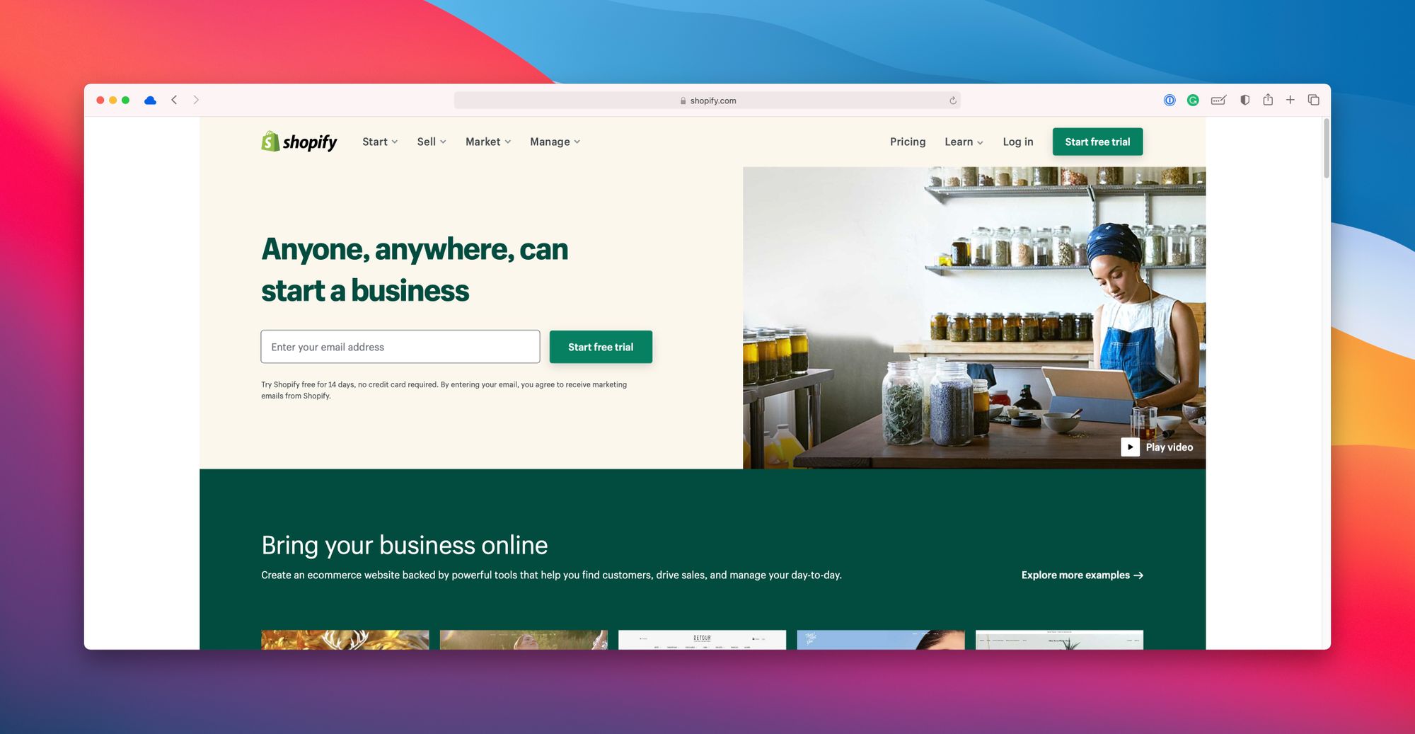
Shopify's homepage is a good example of an error-free landing page. It has to-the-point copywriting, multiple CTA buttons (with one call to action), and a simple design.
#6. Poor Quality Content
Do you have poor grammar, typos, or misspelled words in your content? People may not like reading a lot of text online, but they do notice bad content. Hosting poor content gives your users the impression that you're not serious about your business and customers.
Quality content differentiates a great user experience from an ordinary one. Yes, it takes time, money, and hard work to create great content. But once you've created it, you can keep driving higher conversions for a long time.
Remember that great content is great because it addresses your customer's concerns, highlights product benefits, and persuades your visitors to take action.
#7. Bad Typography
The size and font of your headings and text influence the user experience. Your content should follow a "visual hierarchy," where the most important point stands out most clearly, followed by the next most important point(s), and so on. Do some research on font faces and sizes and see what works best for your business and page design.
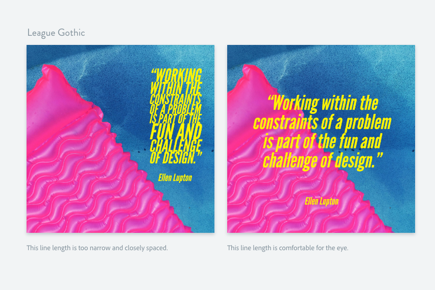
Do not try to emphasise too many value propositions on a single page, as it may cause clutter and confusion. Bold face and italics, though recommended, should be kept to a minimum for the same reason. Do not have too many different font faces, one font for the headlines and another one for the body; that's all you need.
#8. Missing Trust Signals
People only buy from businesses they can trust. Testimonials, reviews, social media following, and comments are some of the most important trust signals on your page. Knowing that other people have done business with you before, and reading their opinions helps reduce anxiety and instills confidence. If you're not using some of these, be prepared to struggle with depressed conversion rates.
#9. Placing Branding Over Value
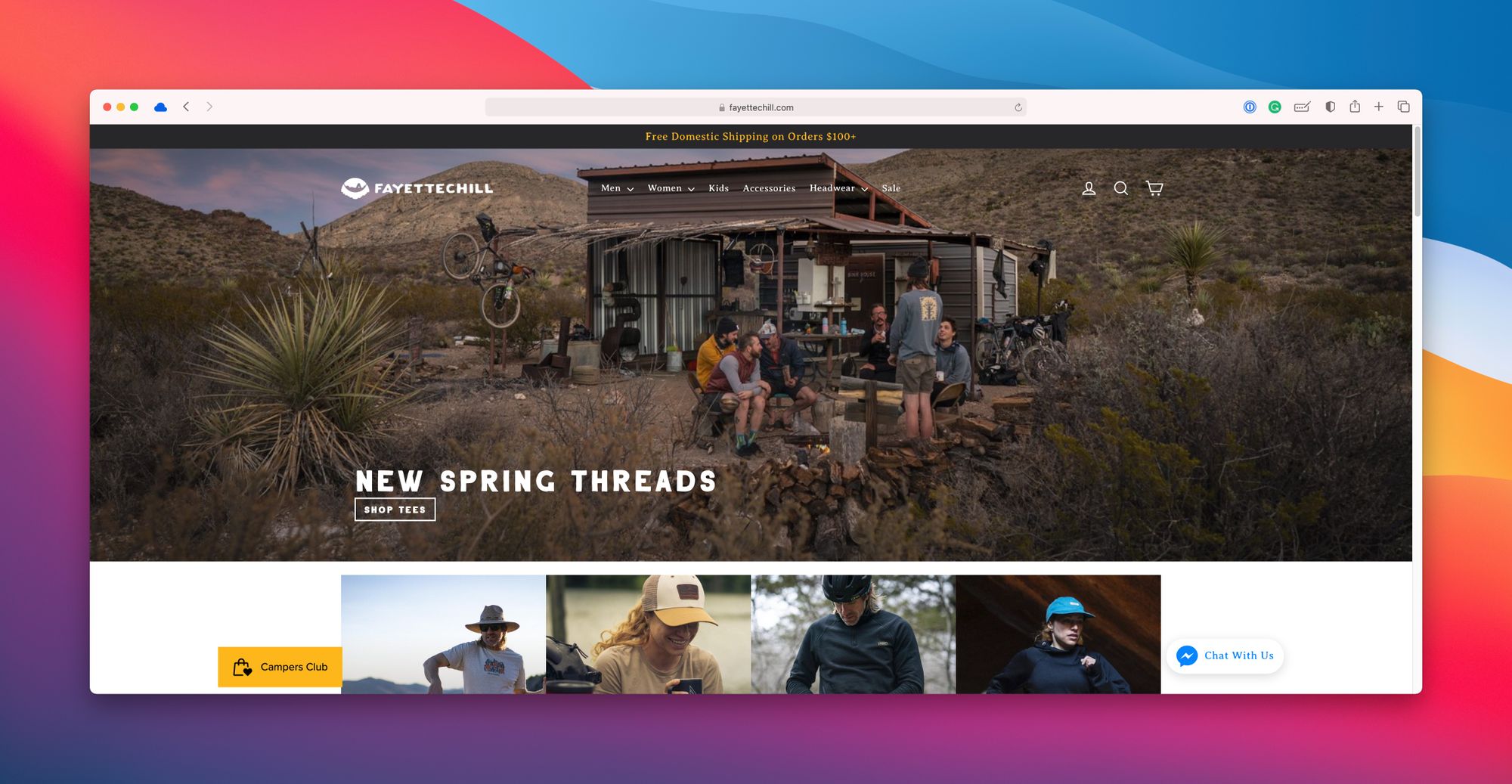
Are you so obsessed with your brand that you're burying the value proposition under your logo, graphics, or self praise? Take a look at the Fayettechill homepage, which doesn’t say anything about the business or the value that it offers to the visitors. Unless you're relying on repeat visitors or strong referrals, placing your brand on top of the value proposition is not a good idea.
#10. Too Little White Space
You'll be amazed to see how many websites have this error. White space plays a crucial role in making your design look clean. It makes different page elements stand out. Sites that don’t have plenty of white space surrounding different elements can look confusing and cluttered.
#11. A Hidden CTA Button
The CTA button should jump at the visitors without them having to look for it. A missing or obscure CTA button can confuse your visitors when they're ready to take action. If they're not dying to do business with you, they can always go to your competitor's website, which probably has CTA buttons that stick out.
A CTA button should look like a button and should contrast with the colour scheme of the page. It should have a reasonable size and should be surrounded by plenty of white space to make it stand out. There's no harm in having more than one CTA button as long as they promote the same action.
Some A/B tests have shown that a red CTA button converts better than other colours, but don’t take it for granted and do your own testing.
#12. Multiple CTAs
Though you can have more than one CTA buttons on a page, they should shout out the same call to action. Avoid asking your users to buy your product, download an eBook, AND subscribe to your newsletter on the same landing page. Multiple conflicting calls to action distract your users and cause your conversion rate to drop. If you want users to take many different actions, have a dedicated page for each action.
#13. Vague CTA copy
Don’t get clever with your CTA copy. Research says bold and direct copy converts better than creative or clever CTA copy. The copy on and around your CTA button should be clear and to the point. It should spell out the exact action that you want the user to take. The copy should give the user a clear idea about what's going to happen after they click the CTA button.
Some tests have shown using first person in CTA copy converts better. Hence "Start My Free Trial" will probably convert more visitors than "Start Your Free Trial," though you must test your own CTA variation.
#14. A Lengthy Lead Capture Form
If you are looking to capture leads on your landing page, ask for the bare minimum information. The length of your lead capture form is directly proportional to the number of people who drop out while filling the details.
The best practice is to only ask for the name and email address. Where you have to use a longer subscription form, break it down into a number of smaller forms and display a progress bar to let the users know where they are in the subscription.
#15. A Confusing Checkout Process
Forcing your visitors to "create an account" before they can check out usually causes many of them to drop out. While there's no way around acquiring your first-time buyers' shipping address, credit card info, or other details, the best practice is to break down lengthy checkout processes into easily palatable segments.
Collect only the bare minimum information that is required. For example, the geographic location of the user may be auto-filled. Other check out conversion killers include confusing shipping rates, not enough payment options, a minimum order amount, an unclear return policy, no guarantee info, etc.
#16. A Painfully Slow Loading Time
How could we forget this lethal conversion killer? Nothing drives away your visitors like a form or page that seems to take forever to load. Research says most of your visitors expect your page to load within 2 seconds or less. If it's taking longer than that, many of them will go away.
#17. A Poor Mobile Experience
The same is true for improperly optimised mobile pages. A page that doesn’t display properly across different mobile devices risks losing most of its visitors. Considering that most of online traffic now comes from smartphones and tablets, a non-responsive/non-adaptive page is a bad news for conversions.
#18. Distractions at POP
Many eCommerce pages try to emulate Amazon's product pages and overload the point of purchase (POP) with too many distracting products. Though you should feature your best sellers as well as products that you want to upsell or cross sell, do not go for an overkill. Do not dump related products, promotions, featured products, opt-ins, navigation, and every other thing near the POP, unless you don’t want your visitors to buy any of them.
#19. No Communication or Interactivity
High converting websites try their best to reduce purchase anxiety by killing the pain points that might be on the visitor's mind. An FAQ section, terms of service, explainer videos, and guarantee information are some of the ways. However, some questions may still remain unanswered. It's a great idea to provide real time interactivity in the form of live chat or telephone support.
Your visitors may not have the time to read through your return policy, FAQs, or other helpful material to look for the answers to their questions. Live chat makes it convenient for them to get those answers instantly. It also boosts their trust and gives them the reassurance there's someone they can talk to if something goes wrong.
#20. Lack of consistency
A smooth user experience is all about being consistent. The content on your page must be consistent with the keywords that are driving you traffic. Your headline should be consistent with the CTA. The design across your pages, the language and style, the action buttons, the fonts and colours, everything should be in harmony.
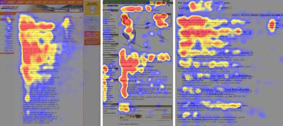
#21. Not Considering Reading Pattern
According to studies, online users follow an F-shaped pattern while scanning web pages. It means the top and left hand side of your page attract more eyeballs. Therefore, your most important product benefits, headlines, and copy should be aligned left and placed near the top of the page.
#22. Not Providing a Price Comparison
Regardless of how great the user experience, people will still not buy your product if it's over priced. Even when you're listing competitive prices, your customers subconsciously want to compare prices with another figure. That's why you see many items with marked down prices in eCommerce stores. Somehow, providing a comparison converts better than providing prices in a vacuum.
#23. Not Testing
Did you know the first and last rule of conversion optimisation? It's ABT: "always be testing." With a plethora of reliable online testing tools available, there's no reason to rely on guesswork for building a high converting page. If you think a new layout or colour will convert better, prepare a variation of your page and go for split testing. Even minimal testing can make a phenomenal difference to your conversion rate.